This module was completely out of my comfort zone and I really thought I would struggle with the technical side of it, however I was surprised how easy I relaxed into it. After the workshops on After Effects I found it quite easy to go back into the program and be able to create something without much help or trouble. I dint think I could pick up a program as quick as I did. Therefore I was able to pick up a few basic skills and was able to use this to produce some effective animations for both silent movie and the movie season.
When we started using DVD Studio Pro, I did realise how organised we had to be for it, even though I was extremely organised on my laptop with files, having no space on my account on the College computers I was having to move all my files from the user work folder to my laptop every time I wanted to use it which went wrong a few times and I had to waste time linking files back from my laptop. Also when using this program we had to have our videos rendered which was fine for the Movie season videos but I was unable to get some of the original footage from the silent movies as I didn’t realise we were going to need it and took them of my account to make more space. Therefore there is one of my silent movies that isn’t on my DVD and one that has missing files (even though I had linked these up again twice), I thought we were going to be able to upload the quick time movies onto our DVD.
When it came to researching into TV animations I found it quite hard to find what I was looking for, most of the idents, adverts, title sequences that I had seen on TV or on movies, I was unable to find on ‘youtube’ or other such sites and so couldn’t reference them properly in my research.
Storyboarding was a big part of this module and I feel that I just didn’t understand what was exactly needed, even though I had produced some storyboards for each ident I didn’t quite feel I had 60% worth of ‘Design for Digital’ work to back up my animations. I also didn’t really see the point in the screen grabs that we included in our DVDs so I dint know how many frames were appropriate to show.
I was actually really happy with my final 5 idents, even though I wanted to go back over a few of them if I had time, I feel that I had successfully answered the brief. At the beginning I was struggling with ideas of how to animate the still I had taken from the actually movies but after the first crits it had been suggested that I focus on other elements for my animations such as the typography and the bats, therefore I tried to keep this a theme running through the idents.
5 things I will do differently:
1. I NEEDED to do more sketching, i had barley enough initial storyboards and ideas to show my development.
2. My organisation on my computer was very organised but i need to be organised in planning my time, when I'm going to need things by.
3. I always forget to tag my blog posts, so by the end i always have a massive job going through them all and tagging them with the module code.
4. I would like to have experimented more with the DVD menu, i was hoping to have it animate throughout each menu but i ran out of time and hadn't planned anything for it earlier.
5. I would be more prepared for the crits that we had, for the first group crit i didn't have all my storyboards and so i missed out on more constructive feedback.
Attendance: 5
Punctuality: 5
Motivation: 5
Commitment: 5
Quantity of work produced: 4
Quality of work produced: 5
Sunday, 14 February 2010

Friday, 12 February 2010
Rational
I have chosen to design and make 5x10 second idents for a 1950s Movie season on Channel 5. I am aiming this at an older generation of people who would remember these films when they were first brought out. I have chosen channel 5 to broadcast these films as the audience of channel 5 are usually of an older generation and they tend to show an older variety of movies.
The tone of voice that I will be using will be of slight humour but quite ‘cheesy’ to keep with the style of the movies and their posters back in the 50’s.
I will be using stills from the posters and the films in my animations to show straight away the style and era that I have chosen, I will also have other animated elements to the idents such as bats, type and frame. The colour pallet will be quite vivid to keep with the style, but I still want to involve greyscale imagery from the movies themselves.
The tone of voice that I will be using will be of slight humour but quite ‘cheesy’ to keep with the style of the movies and their posters back in the 50’s.
I will be using stills from the posters and the films in my animations to show straight away the style and era that I have chosen, I will also have other animated elements to the idents such as bats, type and frame. The colour pallet will be quite vivid to keep with the style, but I still want to involve greyscale imagery from the movies themselves.
Final Packaging
This is the final packaging for my DVD, i have tried to keep the overall structure quite simple and focus on the design itself.


Tuesday, 9 February 2010
DVD screen shots
These screen shots show the process that i took to produce my dvd menu.
i used a few slideshows inmy dvd and setting it up was quite easy but you had to remember to pause certain pages and set the time on others.
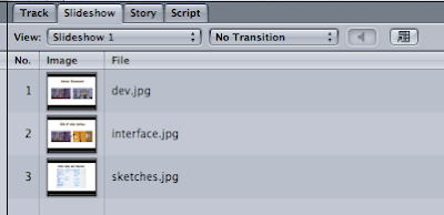
i used a few slideshows inmy dvd and setting it up was quite easy but you had to remember to pause certain pages and set the time on others.


The buttons were the hardest thing for me, remebering to have layerd files and overlays, but having to do so many i finally got the hang of it.


Monday, 8 February 2010


My Final 5
1
2
3
4
5
Vampire Season Ident 2 (diff sound) from Rebecca Liggins on Vimeo.
2
Vampire Season Ident 4 from Rebecca Liggins on Vimeo.
3
Vampire Season Ident 3 Test 2 from Rebecca Liggins on Vimeo.
4
vampire season Ident final from Rebecca Liggins on Vimeo.
5
Vampire Season Ident 5 with sound from Rebecca Liggins on Vimeo.
Sunday, 7 February 2010
Screen Grabs of Idents
These are the screen grabs from my 5 final idents, im not really sure of the puropse of these as they seem to be something in between the storyboards and the actual animations.


Ident 5
This is my final ident, not finished but on its way. It is a bit more sophisticated than the rest as im finsing new effects and techniques on After Effects, i am hoping to have time to go back over a few of the others and make them flow a bit more like this ident.
Vampire Season Ident 5 from Rebecca Liggins on Vimeo.
Ident 4
This ident was the hardest to do for me so far, iv got the idea if what i want but just doing it is proving more difficult, however it dose look very cheesy and quite 'bad' as things did in the 1950s compaired to now so im not to worried.
Vampire season ident 5 from Rebecca Liggins on Vimeo.
Thursday, 4 February 2010
Typography Elective session 4
So this was looking using type and image on a page, this was my first attempt


Tuesday, 2 February 2010
5 Questions
- would it be more effective to have each page of the dvd menu e.g. 'main menu', 'movie season', 'silent movie', animated in the same simple way as the main menu animation i have done, rather than still images?
- should i have the animated bat in each of my idents to keep that link between them, as i have used it in 2 already.
- im a bit unclear about the 'design for digital' i have some storyboards but what else are they looking for?
- is the sound effective enough without having voice overs aswell in my idents? i kind of wanted the music to just show the genre.
- are the animations working in the 'cheesy' 1950's style or are they looking a bit simple and rubbish, please be honest then i can actually work on it. its harder than it looks trying to be cheesy rather than crap.
My DVD main menu
This is my first attempt at the DVD menu, its very simple and quite typical of a DVD menu with the bar coming down. but i know its not quite right yet but im not sure how, i just know that it needs a bit of . . . something.
DVD menu experiment from Rebecca Liggins on Vimeo.
After some feeback from my classmates, i have re-done my DVD menu in a style more fitting to my movie season. i am much more happy with this, for one the typeface is much more fitting, i dont know why it didnt occur to me to use it before! I am hopefuly going to have a short little animation like this for my menus.
improved DVD menu from Rebecca Liggins on Vimeo.
Subscribe to:
Posts (Atom)