Thursday, 25 March 2010

Display stands development

Ok, so after experimenting with the display stands, we still needed something for the windows. These boxes are developed from our original idea sheets and they are removable boxes that can be stacked, hung or just placed around the store and in the windows. They will contain the small display stands inside with the jewellery on show. each box has 3 sides that are transparent material so a full view of the product can be seen from however the boxes are arranged.
This is the first mock up we did to see how it would work and what size boxes were appropriate.


We went on to develop the mock ups to these mount board and acetate so that we got a better understanding of the materials. we also realised that we could have more than 3 sides transparent. this gives more flexibility for the displays and more over alll visibility of the product.


As well as experimenting with the logo we have started looking at the display stands, and trying to simplify them and make them a bit more individual to H.Samuel. We experimented with simple ring holders and chains slots and using the H.S as a way of displaying earrings.


We used perspex to produce some free standing displays with a similar format to the existing once that could be placed in the windows or cabinets. They have been kept clear so that some form of pattern/design can be slid behind it.


A more handmade approach

I tried the logo in a more handmade style, cutting it from paper


Handy Displays

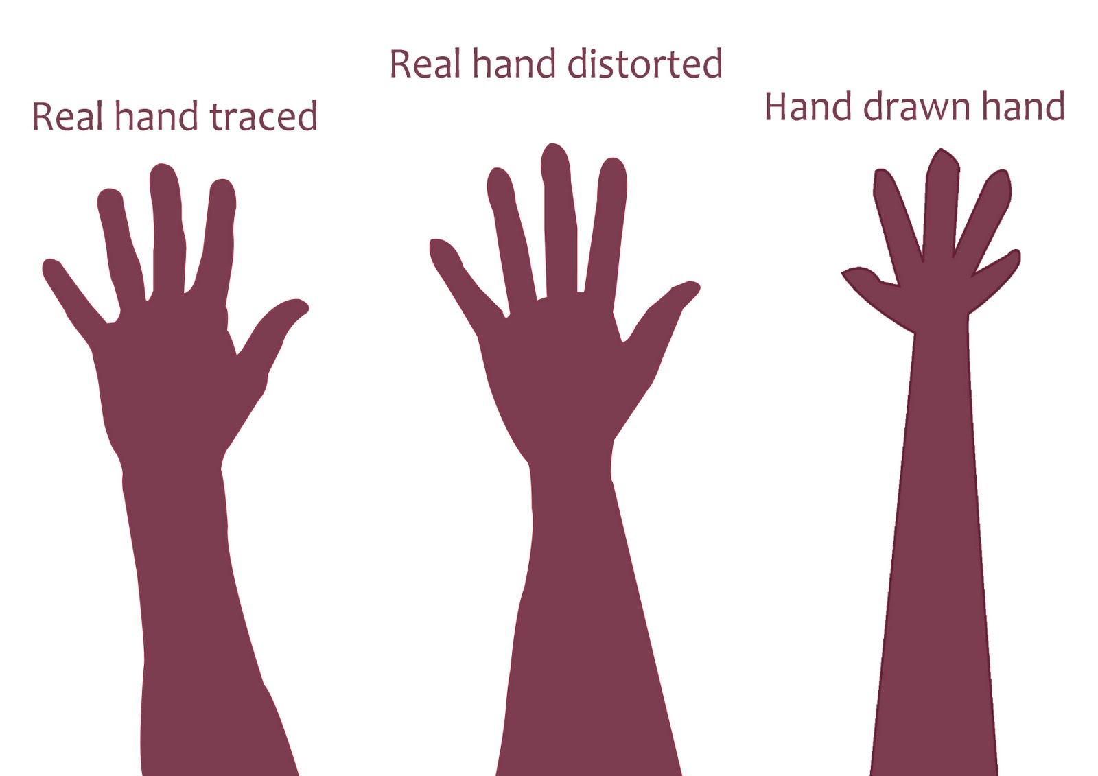
Another idea that came up was displaying watched on a hand shape, so I have experimented with other jewellery and positions of the hand that could work with displaying the H.Samuel products. The idea of the hand creates a more contemporary, fun and individual identity for H.Samuel, so attracting the attention of a younger audience.


I tried 3 styles of hands to compare and see which would fit best for our re brand designs.


I really like the style of the hand drawn hand, which I took inspiration from Saul Bass and Tanishq Jewellery advertising. But after experimenting with this, I realised that it didnt fit with the look of H.Samuel and so we decided to go with the middle hand.


We laser cut the hand shape out with a stand, with the extended finger length it was able to hold more rings and other jewellery and so was more efficient that the other two designs.

Display units and stands

These are some of the initial ideas I had after looking through some other re brands such as 'Red Brick' and Heyerdhal. My initial thinking behind these was to make the display cabinets less separating, as we have seen from the store photos the store is quite daunting and has these circular cabinets that creates a barrier between staff and customer.


Firstly looking at the cabinets i was developing some free standing cabinets that could be moved around and changed wither seasonally or just to create a new layout once in a while. I think having these temporary layouts and displays is a great idea and allows a store to keep changing with its market. So as well as the cabinets I looked at display stands and having a boxes that hold interchangeable designs inside but also so that the boxes can be changed. They can be stacked together or singularly or hung together or placed into different slots. 

Laser Cut

After me and Luke had been inducted onto the Laser cutter we were able to use the cutter when we needed. We decided to experiment with the H.Samuel logo to see what we could come up with.

By Cutting the letters out we were able to play with the kerning and the initial layout of the logo, and with clear perspex adding a coloured back drop was really easy.


This was 3mm perspex and was really nice in creating this depth. 


We also used materials acetate so that it could be easily manipulated around other medians that we were thinking about. But when it was cutting it produced this rusty coloured dust which was harder to remove from the smaller letters, still not sure why acetate dose this, but sure it could be a great effect for something else.


Just showing how the laser cutter actually works.


Again just looking at the layout of the letters and how to play with the depth and the backdrop colours/patters. Its a great way to be able to produce loads of different layouts of something really quickly.


As well as 'cut through' you could also use three other effects, 'kiss cut', 'engrave' and 'rasterize', here we used a 'cut out' effect for the 'jewellery and gifts' and then a 'rasterize' effect for the 'H.Samuel' with a 'kiss cut' outline. although this is a great effect for subtlety  and for a tactile quality I think for the logo its a bit to subtle.


As we kept to the same measurements for all the designs we were able to mix up the different medians for a different effect. We played with placing the clear perspex into the white perspex cut outs and vice versa, I really like this effect and think with the branding colours this could be an effective technique.


Again playing the depth of the letters we looked at placing these 3D letters into a 2D background, also engraved with the logo, but it makes the brand name stand out a bit more than the rest of the logo.


Wednesday, 24 March 2010

Monday, 8 March 2010

H.Samuel logo experimentation


Over this weekend both me and Luke have been experimenting with the H.Samuel logo and how to 'revive' it. We want to give it a fresh new look but it is importand that the current customers still recognise and trust this brand.

This is the origional logo


These are some of the experiments that i have been doing, these are some of the onces that i think work well.
I have kept to a sans serif typeface, Gill Sans, and tryed manipulating the layout slightly on each one, also looking at the point size, weight, leading and kering of the logos aswell.


Thursday, 4 March 2010

New Brief

The Brief
H.Samuel needs to be refreshed to see more products all year round

Concept/Proposition
H.Samuel are as individual as its customers

Background
H.Samuel have been established for over 140 years and are still seen as a traditional jeweller that they are

Target Audience
Split audience, 18-29 and 30+, each with a different approach within the H.Samuel Brand

Tone of voice
Friendly, Approachable, Magical

Considerations
Applying their tag line 'Helps you say it better'.
Consider alternative jewellery competitors e.g. Accessorize, Pandora, Boutiques.
Dose all the stock need to be on display?
How will the existing customers react to the changes to the familiar brand.

Mandatory Requirements
Concept to be applied to at least 3 different medias

Deliverables
3-5 Proposal boards

Time for a re-think

After the crits yesterday me and Luke have gone back to the beginning and re-written out brief and decided to go for the re brand of H.Samuel.

We believe that the problems for H.Samuel are :
  1. They need more customers of a wider audience
  2. Their stores are cluttered and over whelming with the choice of stock available
  3. The stores don't seem personal or relaxed
  4. Promotional material doesn't match the stores colour scheme
  5. Displays are very dated, generic and manufacture
We intend to inform to a split target audience of years 18-29, and 30+, and promote that H.Samuel is as individual as its customers.

In order to achieve this we will re brand H.Samuel beginning with the logo and the identity, from this it would determine colour feel and possible design influences, from P.O.S and advertising. Then moving onto stationary, possible layout and display solutions.

This will be produced using :
  • Print finishes e.g. foil blocking, embossing
  • Hand rendered resolutions and development
  • Cutting techniques e.g. laser cutting, hand cut
  • Paper engineering
  • Typography

Wednesday, 3 March 2010

First Cirt Feedback


These were the boards that we presented to the class in our crits today, we pitched our problem, concept and brief and was given feedback from tutors and other class members. They brought up some really interesting points that maybe were not working for us or that we haven't considered so it was really useful.

  • What gifts do H.Samuel have that are aimed at a younger audience of 18-35 year old?
  • How do other company's/retailers sell to their particular audience?
  • 18-35 is a big age gap and can vary a lot in between, maybe narrow down this audience or somehow divide it.
  • How is the packaging going to be appropriate to the target audience?
  • What is it that we are trying to say to potential customers? ' Shop at H.Samuel because . . . ', affordable? quality? well established jeweller?
  • What are the target audience already wearing?
  • Who buys jewellery for the target audience? themselves? friends? family is this going to be a more appropriate audience
  • Re brand? staying safe and designing superficial approaches wont be enough to get people noticing H.Samuel
  • What language is appropriate for your audience? What language are competitors using?

Tuesday, 2 March 2010

Initial Ideas and Concepts


These are some of the initial concepts and ideas that we had, looking at how we can get H.Samuel noticed from the outside. Window displays, P.O.S, in-store imagery and advertisments. At the moment we are focusing on the window display and what we can put in there to make it a bit different to every other jeweller.


Monday, 1 March 2010