Showing posts with label typography. Show all posts

Sunday, 10 October 2010


Iv come to a bit of a dead end on paper today so iv been experimenting on the computer to see what i can come up with. I want to start developing things more quickly and looking more finished and these designs are getting me there. I started with wanting to make this text work on its own rather than replyin on image to bring it together so i decided to use some of the photos iv been looking at through 'Astronomy picture a day'.

These are very different from what i have been doing before but i think these really work and something i can use within the editorial work that im looking at.


Saturday, 9 October 2010

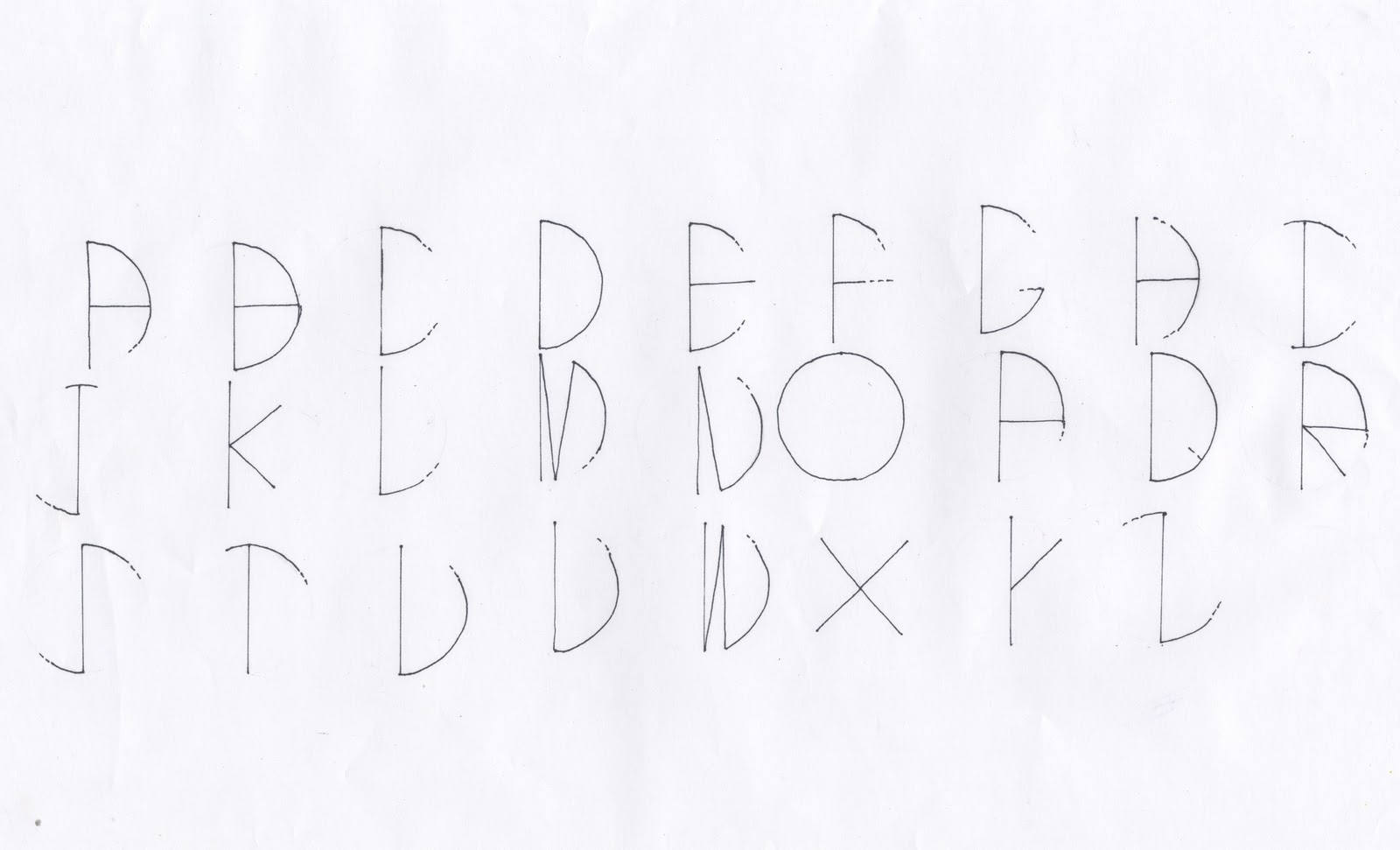
Astronomy Typeface


I have been developing some typefaces to go with this project, Im not sure if Im going to use them all within the pack but i feel that these three are quite strong and Im going to develop them further just to see where they go. 

They are all based either around shapes relating to space such as circles or project a feeling of astronomy. They would all work better once i get them uploaded and developed digitally, so hopefully i can start designing with one of them for the pack.


Wednesday, 29 September 2010

Astronomy - further experimenting

Simply adding the type and image together. Its really starting to take shape in terms of an instant visualisation of astronomy.


Astronomy - Space type

This project is going to be heavily based on type, not just all the body copy but as part of the visuals so I have been experimenting with the word 'space' (to begin with) to see what i could come up with.


These are a few of the ones that i think are more successful.
although this isnt legible, i still like the idea of it and using a grid based around the orbit circles of planets. This could be incorporated into the design of a page easily.


This type gives a very retro feel, even though i really like this, im not sure that it is appropriate to the designs of the star pack. But this could possibly work for any posters or visuals like that rather than in a information booklet.


Again this is a bit of a retro look but could be developed and used.


One of my pet hates is when people stretch and distort text in designs, but this dose rather remind me of that. However it could be appropriate with some development as its based again around the orbit circles.


Developing the above type i cut this font out of circles so you still get that orbit feel but it doesn't look stretched and distorted. This really works in with the circle shapes im using for the planets.