Thursday, 21 October 2010

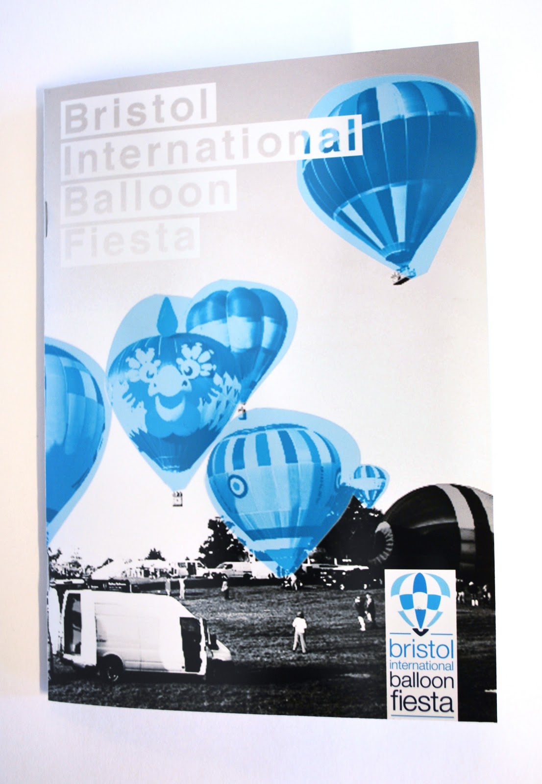
Balloon - final publication


This is the final publication for the event, these will be placed around the UK and handed out to be distributed to families (and other visitors) who are looking for a stunning event. The layout of the publication is kept simple and clean using the same identity of images throughout.


Balloon - event tickets finalised


Im really happy with this design, something simple but effective that stays part of the whole identity. The lighter colours worked better as they enabled the customer to focus more on the information rather than the design. 


The tickets perforated perfectly and so im really happy with how they have turned out.


Balloon - event tickets development


I developed one of the ideas and experimented with the layout, colour and different elements to put on. I had already used elements of the logo within the ticket so i wasn't sure weather or not to use the actual logo on the tickets as well. But I think its essential to tie it in with the reset of the promotional material and the event.

Creative Team - Newsletter Final

After taking on board what others said about the newsletter i have kept the format and changed the layout inside, It really is true that you should always design to a grid!
Firstly i changed the colour scheme to look more creative, as we are able to sue up to 2 colours i want to take advantage of that are really show it off.  


On the two side folds i added some general information instead of another article, which works best as it introduces you to the articles inside.


I kept the format of having two articles and images to a page but i designed them in a grid so that they would sit better on the page. I was worried about the creases in the folded pages and if it would distort the body text or images but it worked really well and when folded out like this, it works as a newsletter.

I also added subtle hints of the two colours through the newsletter, keeping the images grey scale I highlighted them with a coloured triangle in the corners, and used the colours to separate the images from the text.


Balloon - tickets format ideas


I really want to make the tickets something more than just another throw away ticket, i want it to tie in the rest of the material. Im trying to include the balloon shape of aspects of the event to create the ticket format. I also dont want any waste paper, a budget client wouldnt want tickets that waste half the stock, even if it dose look amazing.


I decided to use this design, it has an unusual shape that links directly back to the event but i am able to fit them together in a way that there is no waste paper. PERFECT

Creative Team - Newsletter development


I came up with this layout based on the shape of the leaflet, it follows this triangle shape throughout the newsletter. Each article and image is contained in one triangle and 2 per page which creates a nice composition and fluidity running through the book. 

However i might need to rethink a few things as the images are all different sizes and can be difficult to recognise what they actually are. 

After the crit today people seem to be quite positive about the format of the newsletter, however the layout inside wasn't working. The articles that are contained in the triangle shape don't read well as each line is a different length, and also the images are to abstract looking. 


Creative Team - Leeds College of Art Newsletter


As part of the Creative Team we have been given some live briefs to work on with a short turn over, I chose to re design the College newsletter. 

I chose to use a creative paper fold to make this newsletter look interesting and represent the creativity of the Institute. These are some initial mock ups to sort out the layout and orientation of the pages.


I then quickly mocked this up to add some content and see how it worked properly. As we can use up to 2 colours plus black i want to use colours to really enhance this design.


Obviously i need to reconsider the orintation of the type on the page so thats readable when opening the newsletter. 


Astronomy - Polyhedron Skyglobe

Iv downloaded this net from Richard Powell to create this Polyhedron of the star sky, I'm going to apply my own graphics to it but i just wanted to see how easy it was to make and what its actually like when its made up.

I really like the shape of this, as its in triangles i think it looks more scientific . . . not sure why but it works better than the globes made from squares and hexagons.


Balloon - publication ideas

Im going to be producing a publication as part of the event promotional material for the 'Bristol International Balloon Fiesta' and these are just a few of the ideas for layout and such that iv come up with. These will be developed further at a later stage but for now im focusing on creating a certain feel using the identity. This should appeal to families and look relaxed and friendly so that's why i have been using grey scale images but with a block simple blue over the top.

Crit 1 - OUGD301

We had out first crits of the year today to look through out briefs, rational and statement of intent. After this session i realise that my briefs don't correlate to my rational and so people were getting confused with what i was trying to gain from each brief.

A few points were raised about certain aspects of the briefs that maybe weren't relevant to my practice or that were not going to work, or at least something to think about.

Points Raised:

Sunday, 17 October 2010

Balloon - blue skies


Iv developed the initial ideas to use the black and white image and use a block coloured shape over the top to create emphasis on the balloons. 


I was using the new CS5 photoshop and so was testing out some of its new features such as the 'content fill' its probably not something im going to use in my final work, but i though it created something quite interesting and more abstract.


Balloon - half tone and block blue


Now that i know the approach i am using i need to narrow it down so that i can keep a consistent identity through the promotional material. I have taken on of the photos and experimented with different variations on half tones, opacity and size.

Original image


original image made grey scale and then applying a half tone.

Half image with block blue shapes at 100% opacity.

Half image with block blue shapes at 80% opacity

Half image with block blue shapes at 50% opacity

Half image with block blue shapes at 20% opacity

Half image with expanded block blue shapes at 50% opacity, also a multiply took used to bring out the black

Half image with smaller block blue shapes at 50% opacity, also a multiply took used to bring out the black

A larger half tone effect applied with a 50% bock blue shape placed over one of the balloons.

Half image with expanded block blue shapes at 50% opacity, but with a 'lighter' effect added  to the main balloon.

I have had some great feedback about which of these work best and which really don't work for this. 

The smaller halftone seems to be favoured and i agree, i dont want to give off a 'pop art' feel to this so keeping it more subtle is going to work best. 

Also the 50% opacity of the blue shape is defiantly the one that works the best in terms of highlighting the balloons.