Showing posts with label Brief 2. Show all posts

Tuesday, 14 December 2010

Balloon - Image Change


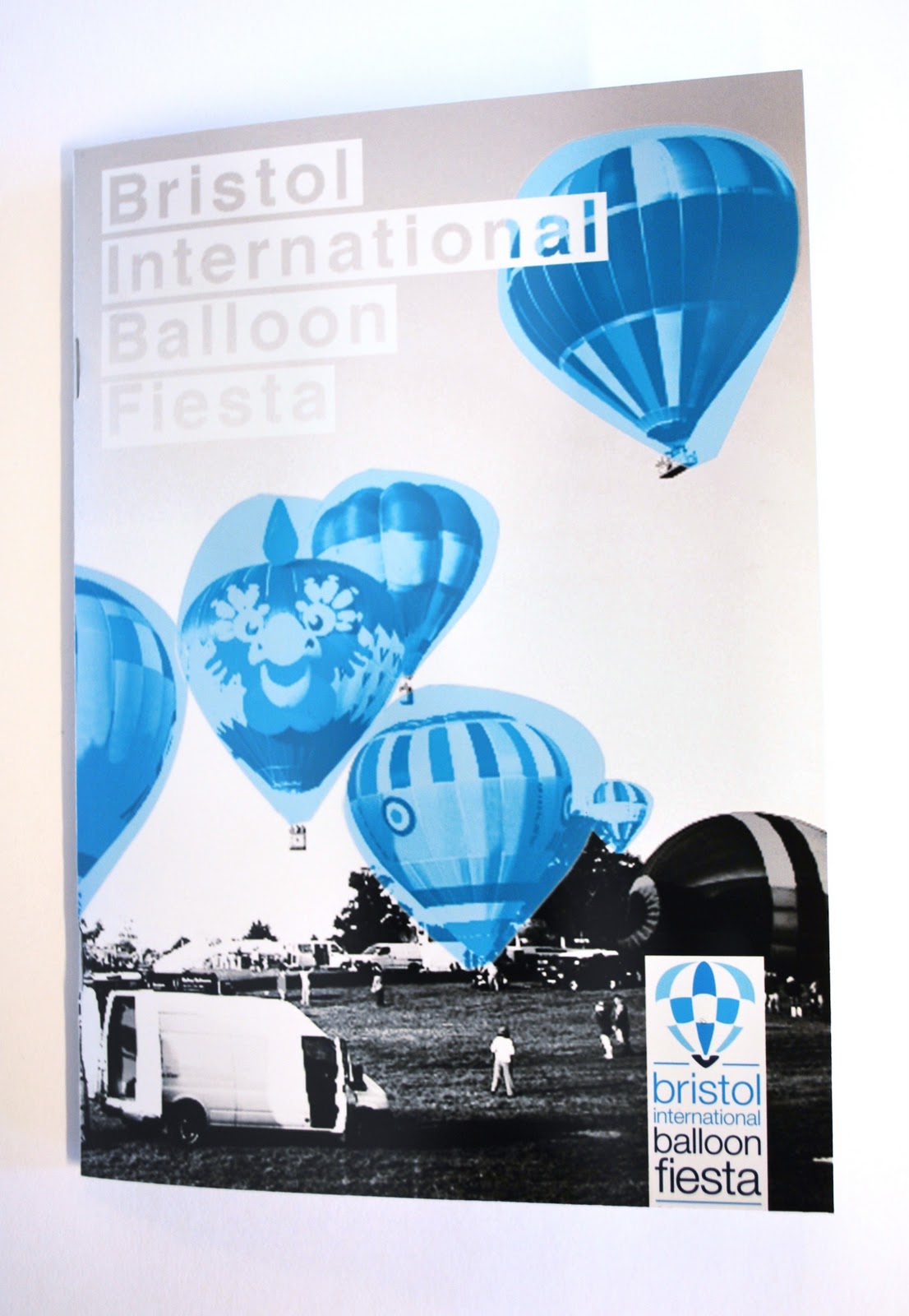
Heather managed to find me this high resolution image of a hot air balloon event so that i can use it instead of the pixelated images i have at the moment. 

Its a great image as there are some nice sections to choose from for my cover and then my poster and banner. 

If you want to see the developed designs with this image then the continue here

Wednesday, 1 December 2010

Balloon - Photo Shoot


These are some of the final product shots that i have taken for the Balloon Fiesta Promotional Material. I also have a publication but i am hoping to have that finished by the had it so those photos will be up within the next week hopefully. 

I am very please with the designs, however the poster is still getting mixed reviews, I have tried adjusting it but its still not quite right so this will need to be developed a little more before hand in.


Wednesday, 24 November 2010

Show and Tell


The show and tell crit today went really well, was a nice different way to crit peoples work and i got some really constructive feedback.

Was also nice to see everyones works out and presented on the tables, i'm realising how must people are doing and to such a high standard. 

Feedback:
  • You need to sort out your imagery for the balloon brief, the layout is nice but the image is still pixelated.
  • sort out the kerning on your balloon brief title, its a bit spacious.
  • Defiantly keep the box white, it keeps more in with the identity of the brief. Would defiantly work with the glow in the dar design on this.
  • Would be nice to see more of the products, even if they are mocked up.
  • Film Festival brief looking really good but the dvd/ticket doesn't really work. 
  • Think it would be better if u had a separate ticket to a dvd as people wont carry the dvd around the festival with them.


Wednesday, 10 November 2010

Crit 3 - OUGD301

We had our 3rd group crit today to showcase the work we are up to date with, this was a chance for me to get some opinions on what others in the studio thought about the resolved designs i had been working on. I got some great feedback, lots of constructive comments and was good to hear some positives as well so I understand what people actually react to when they see my work.

Points that were raised:

  • Consider the legibility of the custom made typefaces, 'constellations' is not readable without looking hard.
  • Do your postcards need to be custom, e.g. do you need to be able to write on the back of them? This may come with your context, where are you selling them and who to?
  • Need to consider stock more, how is this going to inform your design?
  • More analysis needed on Design Practice blog
  • Need the written briefs more dominant on your blog
  • Make sure you keep your specified audience in mind when designing
  • Keep your blog up to date, dont fall behind in recording your work
  • Check the position of your planets on your postcards, they dont seem all be centred. 
  • Check grammar and spelling on your work e.g. 1 moons should be 1 moon.
  • Your blog is OVERWHELMING, needs to be organised as its impossible to follow.
  • Do you have any live briefs or competition briefs on the go?
  • Balloon project, the image needs to be reconsidered on the front cover.
  • Would it be possible to spot varnish the planets as well as or instead of glow in the dark? 
  • We really like the crinkled constellation design that you did, could this be something your develop?

Monday, 8 November 2010

Crit with Fred

I had a one to one tutorial with Fred today to run through my work and how things are going so far. It was good to talk about my work just going through what i needed to.

I sort of went along with not to many problems in mind, so i ran through the work that was nearly resolved and Fred went through with me what was not working or thinks that should be improved.

Balloon
- Must sort out the images, if there is a way to obtain high resolution images, or maybe use sections of them so would not have to expand them so much.
- The contrast of the darker sections to the lighter and the blue do not work, attention is instantly drawn to the muddy field and this is giving the wrong message.
-

Monday, 1 November 2010

Balloon - Image distortion


Original Cover

The next stage was to work on the images, as i couldn't get hold of any high resolution images i was advised to g the other way. Instead of trying to sharpen up the image, i should distort it more and make it look more intended for the image to be low resolution. 

I have tried all sorts of different effects such as blur, pixelate, noise and image size to achieve a distorted effect.

Cover Adaption 1

Cover Adaption 2

Cover Adaption 3

Cover Adaption 4

Cover Adaption 5

Cover Adaption 6

Cover Adaption 7

Cover Adaption 8

Cover Adaption 9


From all of these adaptations i thing number 4 and 9 work the best, the rest are either really difficult to look at, loose the balloon shapes completely or give the wrong approach to the identity.

Balloon - Layout extended


I have applied the format throughout the rest of the publication to make sure that it runs through. It was more difficult to layout this double page as it only has 3 columns instead of the even 4. 


Balloon - Adjustments


One of the major problems with the Balloon publication was the column layout, it was to high in leading and to few words per line and so people had difficulty reading it. Iv increased the point size by one and decreased the leading by 3, also changed it to left justified. It defiantly reads a lot better but there are still few words to a line.


As much as i like the aesthetics of the 3 column grid, it doesn't work for this publication so iv tried a few 1&2 column grids instead to see what is going to be suitable to the design as well as being legible.


Balloon - Adjustments


Feedback from Joe Gilmore and other people n the studios have pointed out that through the publication i have lost some of the identity that i have built up for this project. The reverse out type for the titles that i have used for the promo material and the publication booklet was a big feature of the identity and that i should consider using it through the booklet. Also this would help to make the type more legible as the white type gets lost within the greyscale image.

After applying this throughout the booklet it started to bring it together and made this title in particular stand out on the page.


Monday, 25 October 2010

Joe Gilmore chat

I had a chance to actually talk to talk to Joe today and show him my work after the group crits. He gave me some really positive feedback, which is always nice but he was also able to give me some advise on where i need to take it next.

He pointed out that the publication looses the identity i have built up for the project after the front cover, so bringing some of these elements back into it such as the reversed out type, the heavy contrast image and the making sure the colours are all the same spot.

Saturday, 23 October 2010

Crit 2 - OUGD301

Ok so we have had our second crit of the module and it was really helpful, i got some constructive feedback on my projects and i'm now feeling confident where i need to take them.

Feedback:

  • In the publication make the type left justified as its easier to read, also decrease the leading as its as wide as the gutter.
  • Need bigger columns in the publication, hard to read through the large parts of text. 
  • Title on page 6 doesn't stand out at all
  • The image on the poster is pixelated, could you exaggerate this, photocopy it, scan it, compress, expand, see what you can do to decrease the quality.
  • Try looking at half-tone images, they may work better for low quality images
  • The digital made layouts for the astronomy publication are working well, develop these more
  • Look more into print finishes for this astronomy brief
  • Experiment with UV inks
  • Specify what is going in the astronomy pack, this will help you to realise what you are designing for rather than keeping safe
  • The newsletter can be a bit fiddly, make sure the stock is suitable
  • Take away the red lines in the newsletter, they don't work
  • Maybe you should work to a grid, they work for a reason.


After this crit i went away and decided to look over my work again, im getting pretty excited about the new ideas im getting. 

The balloon event promo material could potentially change quite a lot from what it is now, but i want to experiment with the images as suggested and see how that can aid my design.

For the Astronomy project, iv now had a great idea of instead of using UV inks im going to look at glow in the dark inks, as they would be more suitable for the audience. Im going to develop my concept into dealing with light pollution.

The newsletter breif only needs a few aspects changing so i can finish that today and make the articles sit better on the page before the hand it tomorrow.

Friday, 22 October 2010

Balloon - Billboard


I have also designed a billboard ratio design for larger distributions.


Balloon - Poster


This promotional material stretches across a wide range of media, here i have designed a poster that can be up to A0 size for distribution across the UK. It contains the simplest information, and a website for any further information people might want to look up.


Thursday, 21 October 2010

Balloon - final publication


This is the final publication for the event, these will be placed around the UK and handed out to be distributed to families (and other visitors) who are looking for a stunning event. The layout of the publication is kept simple and clean using the same identity of images throughout.


Balloon - event tickets finalised


Im really happy with this design, something simple but effective that stays part of the whole identity. The lighter colours worked better as they enabled the customer to focus more on the information rather than the design. 


The tickets perforated perfectly and so im really happy with how they have turned out.