I just want to point out that i DID NOT set this kerning on this document like this, for some reason when i upload to Issuu the layout and type and complete ignored. but at least you can see it
Thursday 29 April 2010
Wednesday 28 April 2010
1st Crit
- What range will you be developing? Categories, location, audience
- Make some decisions about what you want to do? is it about typography or packaging or mainly print based? and where is this going to take you?
- Editorial design can be a whole magazine or layouts, is it relevant to do a full magazine, is this your range?
- If you want to use printing techniques then make sure you know what is going to be appropriate and not going to look out of place, if this what you are lead by?
- How are you designing for both digital and print? will you have a range for both? digital can be downloadable into phones, comps.
- Don't be driven by audience.
After the crit I was really buzzing with ideas and wanted to get really stuck in, so I started making some decisions on my content and the design direction I want to go in, and have edited my brief accordingly.
I think the main points that im going to focus on within the next week is the research on the idioms looking at what they mean, and where they originated from. Also looking at design direction, looking through other designers and what i am aspiring to do through this project.
Im also going to get some quick ideas down on to paper and see what sort of ideas are going to be appropriate to my personal brief.
Idioms
Iv compiled a list of over 300 different idioms to start of my research, I have then put these into very basic categories based in the actual idioms rather than their meaning or origins :
Actions - 23
Animals - 24
Body - 27
Clothes - 14
Colours - 39
Colours - 39
Food - 47
Money - 7
Nature - 36
Nature - 36
Numbers - 9
Names - 35
Places - 7
Religion - 28
Time - 12
Travel - 6
Weather - 31


I'm going to narrow these categories down so that i can focus my research and my range, so that i can produce something a bit more concentrated than where i am right now.


I'm going to narrow these categories down so that i can focus my research and my range, so that i can produce something a bit more concentrated than where i am right now.
Sunday 25 April 2010
What Brief do I want to do


Ten Things that make a Good brief
- Clear content
- Enjoyable/fun/appropriate
- Defined audience
- Specific outcomes
- Appropriate tone of voice
- Scope for development
- Clear deadlines
- Realistic expectations
Tuesday 20 April 2010
OUGD203 Evaluation
Why have you chosen to work with your creative partner? What are your aims?
What are your specific areas of creative interest in this brief?
What specific design skills do you have to offer in relation to your chosen brief? How do you intend to use them?
What specific non-design skills do you have to offer in relation to your chosen brief? How do you intend to use them?
What will your specific responsibilities be in the collaboration in relation to your brief?
What were your joint responsibilities be?
Monday 19 April 2010
Sunday 18 April 2010
Collaborative boards
These are the final boards that we entered into the YCN competition. we started with an impact board that showed this bag in all its glory. It shows off the new logo, and the new elements that we have added to the bag.

.png)


The second board is where we showed the fine details and each aspect of the design separately. The colour scheme of the brand, the pattern that is applied to the sides of the bag and other promotional material, the embroider ribbon with the logo and the tissue paper pattern.
.png)
The final board is showing the context of the designs, the logo and the colours and the patterns.

Friday 2 April 2010
Bag Mock Ups
Luke started to mock up the bags quickly so that we could have an idea of the shape and proportion we had to play with. We have made the bags slightly squarer than the current bags as we feel this is more appropriate for the gifts that go inside.

This is a little mock up of the bag in a sugar paper, we wanted to see how strong the stock was. we will be printing it on to matt paper on the final though.

These two bigger boxes have been printed on the matt paper and look quite professional, however we had a bit of trouble with the stocks as when we folded it round the colour split even if we scored it. This is something we will have to talk to James about in the Digital Printing room and see if he can suggest any other stock.

This is the final mock up of bags, the logo on front will be foil blocked and there will be thick cord straps for the bag. It will also be filled with tissue paper to hold the gifts inside so they don't rattle about, also a ribbon will be threaded through the bag to hold it close.

Thursday 1 April 2010
Retail bag
We have drawn out some ideas for the bag and the element to it. The different handles, ties and shapes, we still want the bag to look classic and have a look of quality to it.

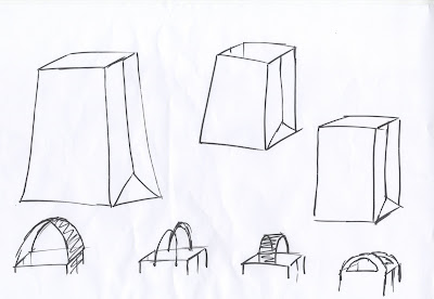


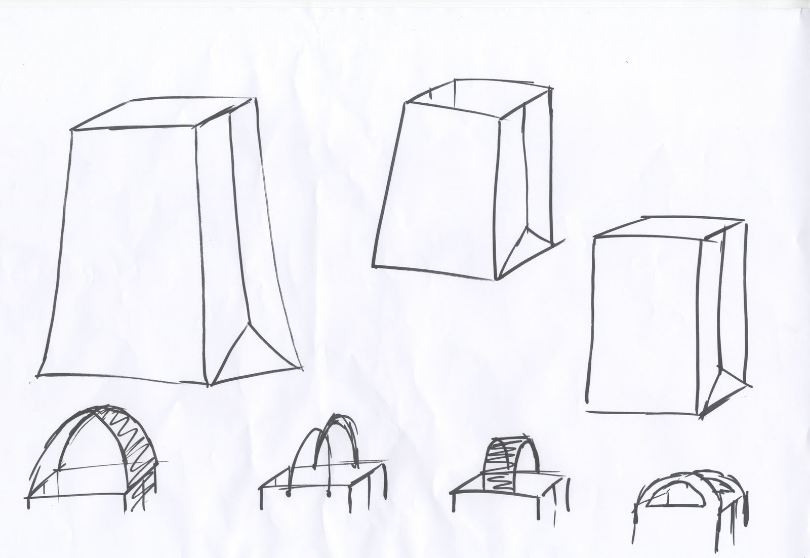
We decided to go with this style of bag something very similar to what they currently have but with a few finishing touches to it. The bag will keep in with the given colour scheme of the store, it will have a ribbon tie through the top to give it a nice feature when customers walk out with the bag, to give them 'the gift experience' when they visit.

Subscribe to:
Posts (Atom)