Sunday, 17 October 2010

Balloon - Images Development


IV started to develop some images to go in the Event leaflet, using a limited colour pallet black and blue with white stock, i have been able to use a few techniques so that i can make the most of the limited pallet. 

Using half tone images is a great way to make an image a bit more interesting and it makes it more versatile to use within layouts as text can be layered over the top with less complications.

I used block colours to lay over the top of the half tone just to add some colour to the image, but its not very bright, so might have to try a lighter half tone.


I really enjoyed creating this piece, having the block shape over the image works really and the fact that its not a perfect fit gives it a bit of character. I dont want anything to serious looking, this is a light-hearted feel event.


Balloon - Blue shapes

As this brief is a limited colour process i have chosen the blue of the logo which is 'Pantone 299M' and am creating balloon shapes to use with the images.


Tuesday, 12 October 2010

Astronomy - cover design


Some quick layout experiments working with the astronomy pictures and type. This could be used as a cover design of the information booklet on space. I know that i have used this reverse type approach in my other current project but im finding that its a great way to lay text over a full colour image. Plus i think it looks great over this image and gives it a modern look.


Sunday, 10 October 2010


Iv come to a bit of a dead end on paper today so iv been experimenting on the computer to see what i can come up with. I want to start developing things more quickly and looking more finished and these designs are getting me there. I started with wanting to make this text work on its own rather than replyin on image to bring it together so i decided to use some of the photos iv been looking at through 'Astronomy picture a day'.

These are very different from what i have been doing before but i think these really work and something i can use within the editorial work that im looking at.


Astronomy layouts


I want to further my editorial layout skill and one thing i learnt from type and grid back in 1st year was this quick and easy way to experiment with layouts of double page spreads. Im going to transfer these into digital layouts and see which work the best.

Saturday, 9 October 2010

Astronomy Typeface


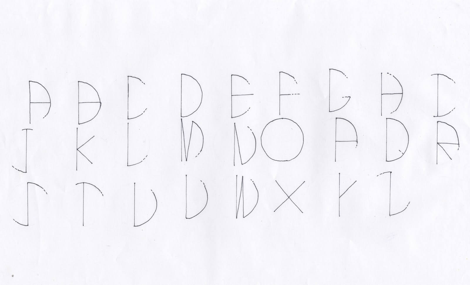
I have been developing some typefaces to go with this project, Im not sure if Im going to use them all within the pack but i feel that these three are quite strong and Im going to develop them further just to see where they go. 

They are all based either around shapes relating to space such as circles or project a feeling of astronomy. They would all work better once i get them uploaded and developed digitally, so hopefully i can start designing with one of them for the pack.


Astronomy Development


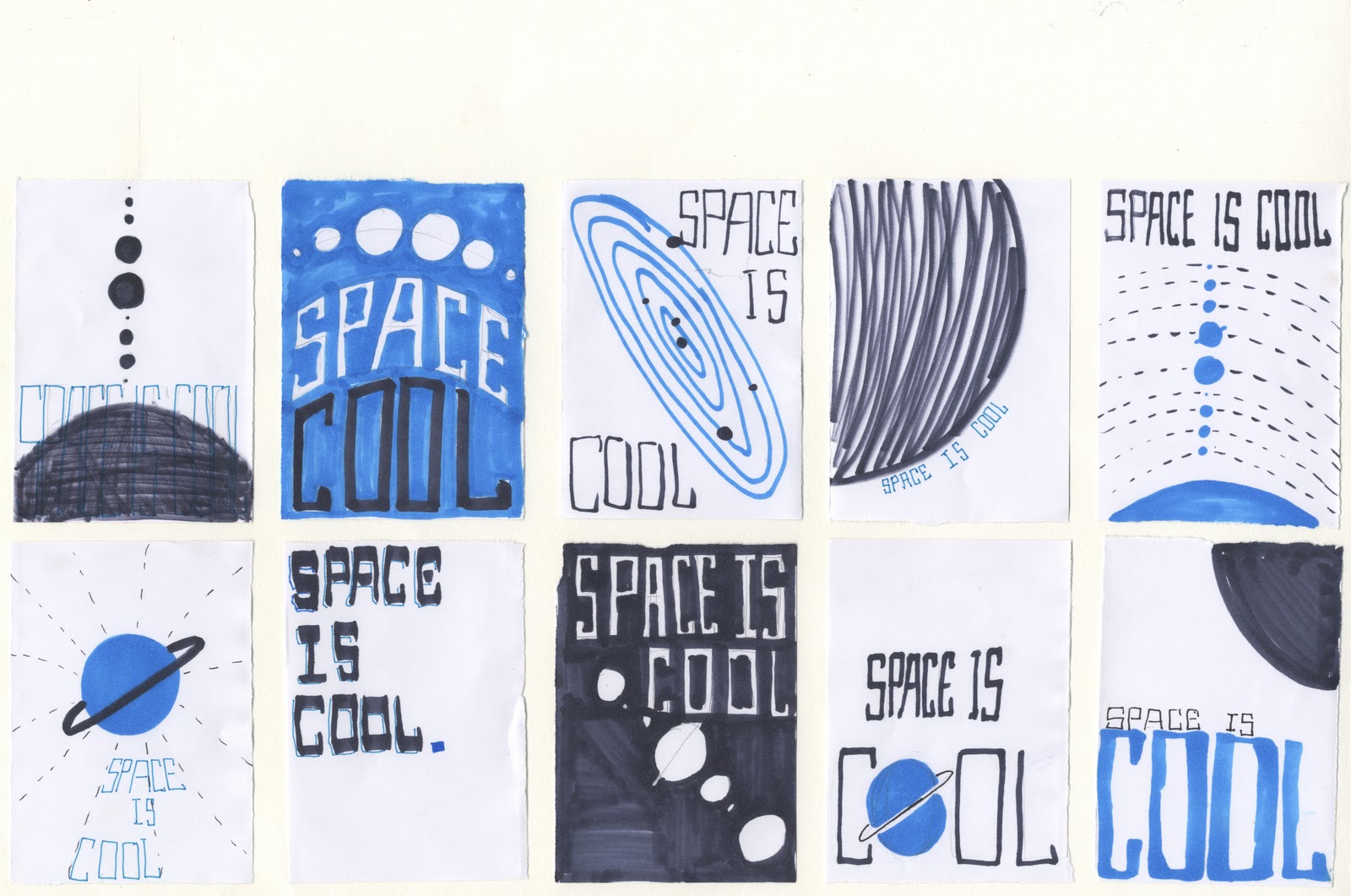
Iv started to develop a few of the initial ideas that i had, experimenting with the layout of a simple poster design. Taking simple imagery of planets and the phrase 'Space is cool' i have looked at different outcomes i can produce. It has to be something eye catching, interesting and all in al works as a single piece of design. 


I have been wanting to get back into the screen printing rooms to develop my skills as the last few times i have been in there things haven't gone to plan. So I'm going to do a simple two colour screen for the propose poster for the pack.

Saturday, 2 October 2010

Hot Air Balloon Brief

This brief has much more direction now, it has a context and a specific purpose which i was lacking in the last brief. This is really going to develop my editorial and layout skils.


Astronomy brief

New Start

This is the first brief i have re written, it hasn't change much but it is more directed to my practice and i am happy with it and feel i can push forward with it now.


Friday, 1 October 2010

Who am i?

Who am I?


Editorial layout and typography for print and web with interest in packaging design.


Photography
- Use to document my work and to capture content for my designs.

Technical Typography
- Use in layouts within publications, body copy to a grid.

Typeface
- Designing and using typefaces.

Editorial
- Use layout skills to design a page of text and image.

Print
- Designing for print, different stocks finishes

Web Design
- Being involved in designing for the web, websites and understanding formats and usability.

Packaging.
- Designing onto nets, how it fits together and experimenting with different folds.


Ok this might seem really simple but this has helped me to identify the areas i have skills in and that i want to progress with rather than trying to develop other skills in other areas.


I want

- I want to produce publications with exciting layouts.

- I want to produce interesting packaging with a type based design.

- I want to produce typefaces that can be used within publications.

-I want to produce usable websites for users.

-I want to understand how print runs work properly.


After all this, i feel that i am a bit more focused on what i want to do and where i want to go, so now its off to look over those briefs of mine and see where they come in!

Thursday, 30 September 2010

PPD Presentation

After todays presentation i have had a sort of wake up call.

Iv realised after last weeks session, i still haven't really decided on the kind of designer i am! I really struggled last week as there are so many areas of interest that i wanted to look into, but now i have finally realised that even if i have an interest in some areas it doesn't mean i have to develop in it!

for example, i'm really interest in branding, i think its important part of design and something that would be useful, but as everyone keeps saying, you don't want to be 'a jack of all trades and a master of none' so now its about realising where my skills lye.

I know that this is what Fred has been trying to drill in to us for the past few weeks but for some reason it clicked today, so i need some major rethinking.


I think my fear is that if i start narrowing down my practice im going to miss out on something, and think maybe iv make a mistake and should have chosen to look into a different area. I do envy designs with one straightforward approach and know what they want, but the fact of the matter is i enjoy designing for a lot of areas. I feel like I'm still learning.


After the panic was over i have been back to my briefs and i have re written my umbrella statement. 

Wednesday, 29 September 2010

Astronomy - further experimenting

Simply adding the type and image together. Its really starting to take shape in terms of an instant visualisation of astronomy.


Astronomy - Space type

This project is going to be heavily based on type, not just all the body copy but as part of the visuals so I have been experimenting with the word 'space' (to begin with) to see what i could come up with.


These are a few of the ones that i think are more successful.
although this isnt legible, i still like the idea of it and using a grid based around the orbit circles of planets. This could be incorporated into the design of a page easily.


This type gives a very retro feel, even though i really like this, im not sure that it is appropriate to the designs of the star pack. But this could possibly work for any posters or visuals like that rather than in a information booklet.


Again this is a bit of a retro look but could be developed and used.


One of my pet hates is when people stretch and distort text in designs, but this dose rather remind me of that. However it could be appropriate with some development as its based again around the orbit circles.


Developing the above type i cut this font out of circles so you still get that orbit feel but it doesn't look stretched and distorted. This really works in with the circle shapes im using for the planets.